The Quiet Architecture of a Personal Website
A long note on making a personal website feel like a place to return to.
There is a particular kind of website that feels good to revisit. It does not rush to explain itself. It does not cover every empty space with a badge, a carousel, or a sentence about how innovative it is. It gives you a door, a little light, and enough evidence that someone is actually home.
That is the kind of website I want to make.
Not a website that behaves like a product brochure, and not a private archive that only makes sense to its author. Something in between: a small, deliberate place where writing can accumulate, where photographs can sit quietly, and where the shape of the interface helps a reader understand how to move through it.
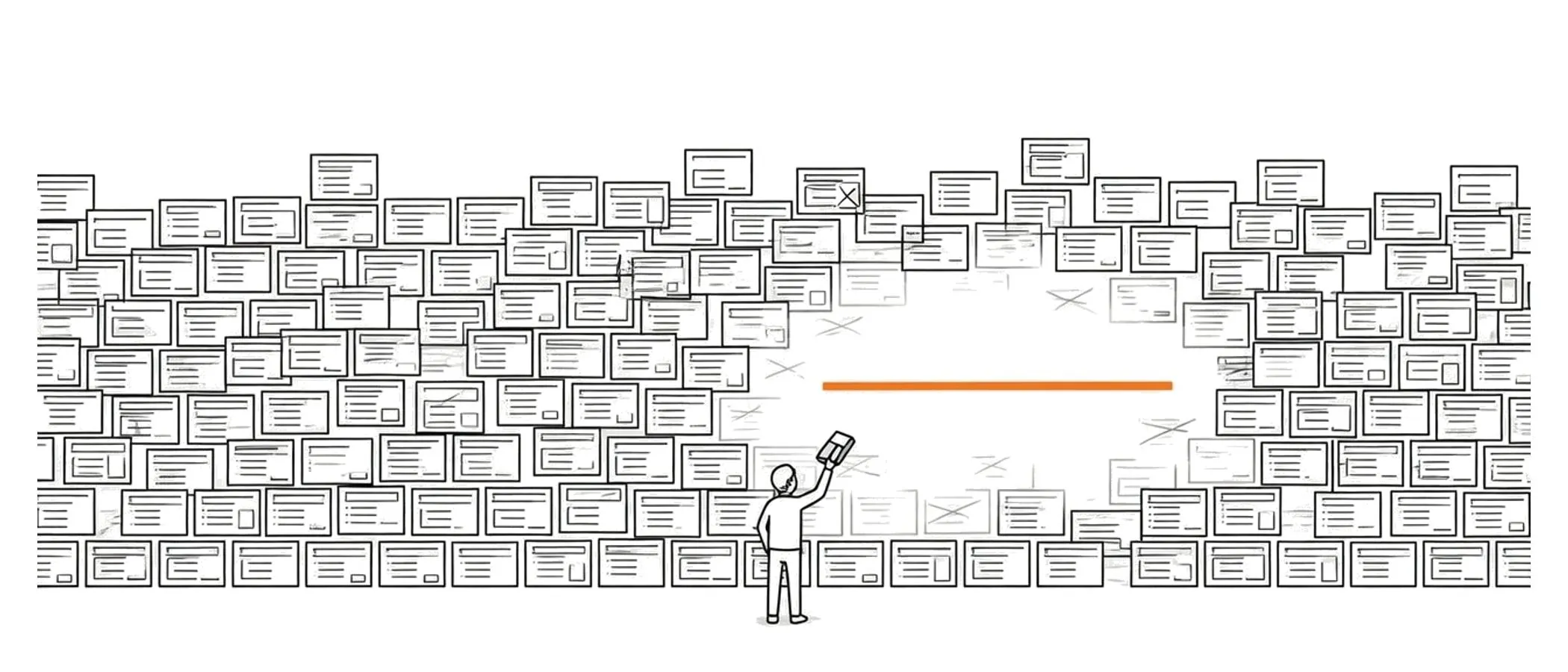
A website is a room before it is a machine
Most web projects begin as machines. We describe their inputs and outputs, draw the routes, choose the data model, and decide which interactions should happen when a person clicks something. All of that is useful. A website still has to work.
But a personal website is also a room.
It has an entrance, a temperature, a sense of scale, and a relationship between its objects. The first question is not only “What can this page do?” It is also “What does it feel like to stand here?”
The answer does not need to be dramatic. A room can be quiet without being empty. It can have a narrow shelf, a large window, and one chair that is comfortable enough to keep. In the same way, a website can have a small navigation rail, a few generous margins, and a reading column that refuses to become too wide.
A personal site should feel less like a control panel and more like a desk someone has agreed to keep clear.
This is why visual decisions that seem minor often matter more than expected. The distance between a heading and the first paragraph establishes whether the page feels hurried. The width of a list tells us whether the author expects scanning or attention. A border that is a little too dark makes a calm surface feel like an application form.
The details are not decoration. They are the room’s acoustics.
The temptation to build a machine
The modern web makes it very easy to add machinery. A new library can provide a search box, a new service can provide comments, and a new component can turn every paragraph into a reusable block. Before long, the project has a dashboard, a build pipeline, an authentication layer, and no new writing.
I understand the temptation. Systems feel productive because they turn uncertainty into visible structure. A backlog looks like progress. A component folder looks like progress. A new content type looks like progress.
Sometimes that structure is necessary. More often, for a personal site, the important question is whether the system makes publishing easier or merely makes the system more interesting.
For this site, the answer is intentionally simple:
- A post lives in a folder with an
index.mdfile. - The frontmatter describes the post well enough to list and sort it.
- Astro turns the Markdown into a static page.
- The same post can appear in a section list, on the homepage, and at its own address.
That is a small loop, but it has a useful property: the writing remains the center of gravity. The interface can become more expressive without requiring the content model to become more mysterious.
write -> save Markdown -> build -> readThe arrows are deliberately boring. Boring arrows are good infrastructure.
What a homepage owes the reader
A homepage does not need to summarize an entire person. It only needs to establish a trustworthy beginning.
The beginning can be a sentence, a photograph, a map, or a list of recent work. Whatever it is, it should answer three quiet questions:
- Where am I?
- What kind of attention does this place ask for?
- Where can I go next?
The first question is about identity. The second is about rhythm. The third is about navigation.
These questions are easy to bury under copy. A homepage can contain an introduction, a set of facts, a gear shelf, a map, and a long list of posts, but the reader should not have to decode the hierarchy. The page should make its order visible through spacing, type, and repetition.
That is why a section title such as “Posts” can be more useful than a more elaborate phrase. It names the thing directly. It does not ask the reader to admire the label before finding the content underneath.
The best homepage sections are also honest about their size. A small archive should look small. A growing archive can have pagination or a “more” control, but it should not pretend to be an infinite stream. A personal site gains character when its limits are visible.
Lists are not leftovers
I used to think of lists as the part of a site that remained after the visual work was finished. The hero had the atmosphere, the cards had the polish, and the list was where the real content was put for practical reasons.
That hierarchy is backwards.
For a writing site, the list is often the most important surface. It is where a reader decides whether an article is worth opening. It is where dates become a record instead of metadata. It is where a collection begins to show its personality through repetition.
A good post row does not need to show everything. It needs to show enough:
- a title that can be read at a glance,
- a subtitle that gives the title a direction,
- a date that locates the thought in time,
- and a clear interaction when the reader wants to continue.
The thumbnail can remain secondary. On a desktop screen it may appear on hover, like a note pulled from a drawer. On a smaller screen it can disappear entirely, leaving the text to do its work. Responsive design is not only about fitting the same objects into a smaller rectangle; it is also about deciding which relationships are essential.
The list should still feel like a designed object when no image has been uploaded. A placeholder is not a failure state. It is a promise that the slot has a purpose and that the content can arrive later.
Markdown is a useful boundary
There is a reason Markdown continues to feel comfortable for personal writing. It keeps the boundary between thought and presentation visible.
The file is readable without a renderer. Headings are headings. Links are links. A paragraph is not hidden inside a block editor that needs to be opened before it can be understood. This matters even when the final page is carefully styled, because the source remains a durable version of the work.
The boundary also makes it easier to change the interface. A post should not need to know whether it will be displayed in a narrow column, a dark theme, or a future reading mode. It should describe the content; the layout should decide how that content is staged.
That separation creates a healthy kind of constraint. The writing can use a small vocabulary of structures—paragraphs, headings, lists, quotes, code, images—and the design system can make those structures feel like they belong together.
The constraint is not a loss of expression. It is closer to editing. A limited palette asks better questions: does this need a heading, or is it only a new paragraph? Is this list helping the reader, or am I avoiding a clear sentence? Would a link be more useful than another explanation?
Designing for return visits
The first visit to a website is often about orientation. The second visit is about recognition.
On the second visit, a reader remembers where the navigation lives. They know that the map can be explored, that a gear item opens a post, or that a date appears when they hover over a row. These small repetitions form a kind of informal grammar.
The grammar should be consistent without becoming rigid. If every element behaves exactly the same way, the site starts to feel generic. If every page invents a new rule, the reader has to relearn the interface each time.
I think of this as a balance between landmarks and rooms. The landmarks stay in familiar places: the rail, the title, the footer, the reading column. The rooms can change their contents: a map on one page, a portrait on another, a list of tools somewhere else.
This is also where motion has to be careful. A small entrance transition can make a page feel present. A hover reveal can clarify that an item is interactive. A theme transition can make the surface feel continuous. But motion should support recognition, not compete with it.
If a reader remembers the animation but not the article title, the animation has become the wrong landmark.
A few small rules that matter
There are no universal rules for personal websites, but a few working rules have survived repeated revisions:
Keep the reading column narrower than your instinct
Wide text is efficient for filling a screen and tiring for reading. A narrower column gives paragraphs a visible edge and makes the page feel intentional. It also creates room for the surrounding surface to breathe.
Let empty space carry information
An empty margin can tell the reader that a section has ended. A pause before a heading can say that the next idea deserves a new beginning. Spacing is a form of punctuation, and removing it is like removing all the periods from a page.
Make the dark theme a second material
Dark mode should not be a simple inversion. Paper, ink, borders, and quiet text each need their own relationship in the darker environment. The surface can become warmer or cooler, but it should remain legible and calm.
Name things plainly
Labels are part of the interface’s voice. “Posts” is easier to understand than a clever synonym. “Gear” is easier to scan than a sentence about objects that have earned a place in a bag. Clear names leave more room for the content to be interesting.
Preserve the path from idea to page
Every extra step between having something to say and seeing it published creates friction. Friction is not always bad—editing needs resistance—but administrative friction rarely improves a sentence.
Maintenance is part of the design
A design system is not finished when its colors and radii have been chosen. It is finished enough when the next change can be made without fear.
That means the project should explain its own conventions. It should be obvious where a new post goes, which frontmatter fields are required, how a section is selected, and what happens when an image is missing. The rules do not need to be elaborate. They need to be discoverable.
The best maintenance work is almost invisible. A small script creates the right folder. A schema catches a typo before deployment. A build confirms that every published route can be generated. A link remains stable even after the homepage changes.
None of these details appear in a screenshot, but they change how often the screenshot can be updated.
This is why I would rather have a modest feature that I can trust than an impressive feature that I avoid touching. A personal website is a long-term object. Its value comes from accumulation, and accumulation needs a structure that does not punish return visits by its author.
The publishing loop
The loop I want is almost embarrassingly ordinary:
- Notice something worth keeping.
- Write a rough version without worrying about the final layout.
- Give it a title that says what it is about.
- Add a short description for the list view.
- Publish it and read it in the same environment as everyone else.
- Return later, when the distance is useful, and edit what remains true.
The last step is important. Publishing is not the moment a thought becomes perfect. It is the moment the thought becomes available for another pass.
A static site is especially good at this kind of patience. There is no feed demanding a new post every morning. There is no notification asking whether the article is performing. There is only the page, waiting to be read again.
A place that can keep changing
The most satisfying personal websites are not frozen portraits. They are records of changing attention.
One year the archive may be full of notes about software. The next year it may turn toward travel, cameras, books, or the difficulty of keeping a calendar. The interface should be stable enough to hold those changes without forcing them into the same emotional shape.
That is the real purpose of a design system here. It is not to make every page look identical. It is to provide a consistent atmosphere while allowing the content to become more specific over time.
The website becomes a kind of external memory—not a complete one, and not an objective one, but a shaped record of what the author decided to notice. Its navigation is a map of interests. Its dates are a record of movement. Its empty slots are reminders that the archive is unfinished.
I like that unfinished quality. A personal site should have enough structure to be trusted and enough room to surprise its owner.
In the end, the quiet architecture is not really about borders, fonts, or frameworks. It is about making a place where a thought can arrive, stay long enough to be understood, and still be there when someone comes back looking for it.